Quick filament review: Prusament PLA Azure Blue
There are far too few reviews of 3d printer filament. For this reason I’m starting a series of quick filament reviews: short filament reviews, some remarks, some findings, and whether I’d buy it again. For this first installment: Prusament PLA Azure Blue.
Prusament
Prusament is the high-quality filament line of Prusa Research - of course known from their 3d printers. The filament is produced in the Czech Republic (Europe).
Packaging and spool
Prusament comes in a cardboard box with a QR code on it. That QR code links to the Prusament website, where you can track the production of your particular roll of filament. My roll has ID 124c87b9 and can be tracked here.
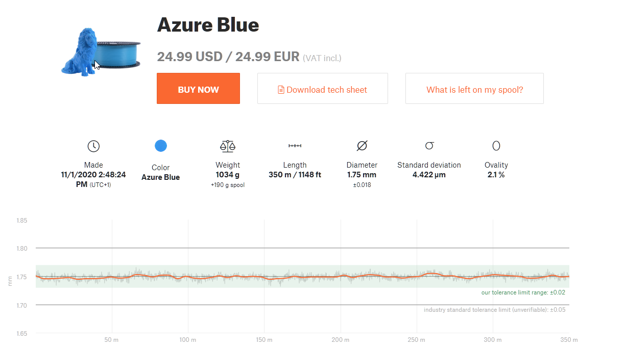 The full history of the spool can be tracked
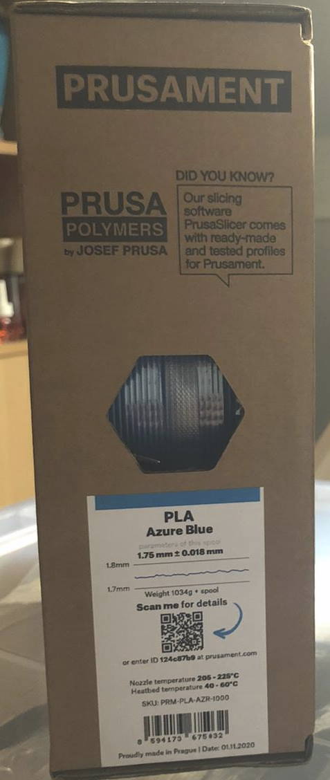 The cardboard box. The filament is inside, sealed in a vacuum bag.
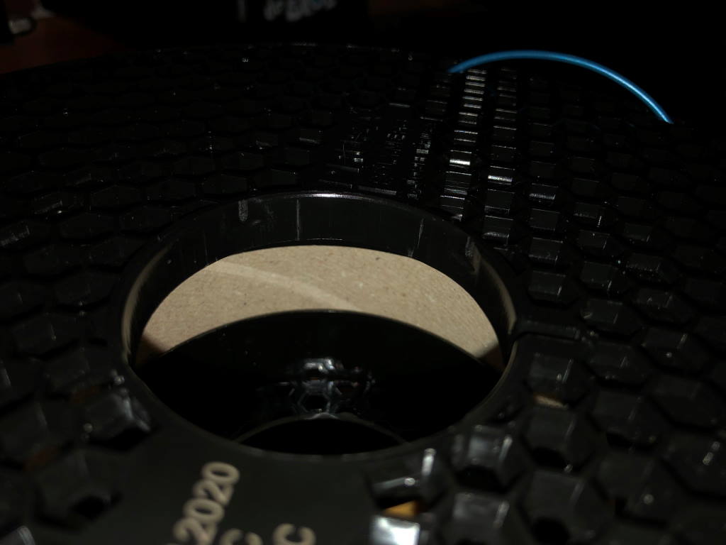
The spool itself has quite a smart design. The hexagon pattern at the sides allow you to lock the filament at any position when done printing. A pretty smart design. It also saves some plastic - which is necessary because these spools are unfortunately not reusable (it is not a master spool).
Prusa did use a cardboard center in the spool - but that makes only a small part of it recyclable - but it does not make the spool reusable.
Printing
At first glance the filament looks pretty good, but for anything other than vases I experienced an pretty inconsistent color. This is regardless of temperature or print speed. The color was not consistent.
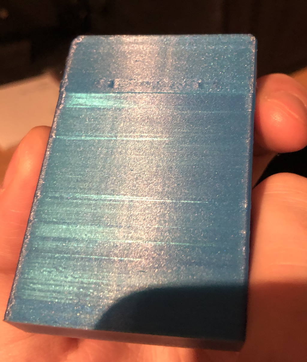 Inconsistent color on a playing card holder I printed
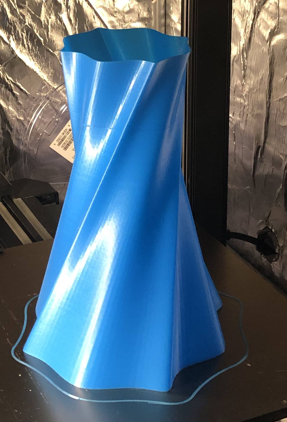 A regular vase printed in vase mode looks pretty good
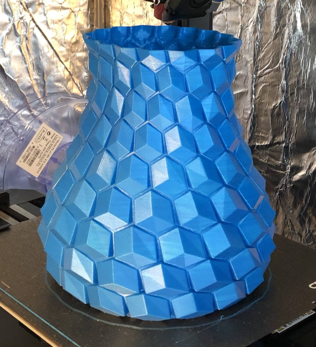 This is a vase, but not in vase mode (2mm thick wall). Some faces show an inconsistent color.
I also noticed that this filament is not usable for ironing. It just makes the colors even worse.
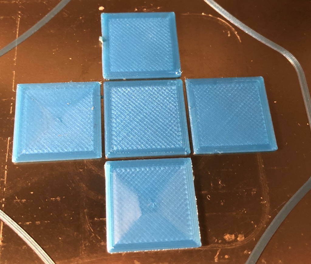 Different ironing settings, including the center without ironing
Pro’s / cons
Pro’s:
- Beautiful color for vases
- No stringing
Cons:
- Ironing doesn’t work on this filament
- Color is inconsistent
Would I buy this again?
No - I would not buy this again. Perhaps this inconsistent color is a “feature” and not a problem - but it isn’t a feature I like.
What are your thoughts?